These are the only three actions required when you open an iPhone or an iPad: Open. Discover. Enjoy. No manual required.
At the risk of writing the two millionth article around the joy of the Apple experience, Apple’s simplicity needs to be reiterated as most of the world has yet to appreciate the competitive advantage it offers.

Time to say goodbye to needlessly complex technology – don’t you agree?
Take feeding a parking meter in my native city San Mateo, for example. I can be in one of the top technology-focused cities around, yet paying a parking meter with a credit card will have me feeling (and looking) like a four-year-old encountering Excel for the first time. It’s crazy.
In technical terms, the UI (User Interface) and more importantly the UX (User experience) were in disharmony with each other. Simply stated, the process totally sucked.
In an era where ‘software is eating the world,’ we have managed to guck up the works, taking what should be a simple fifteen-second task and turning it into a needlessly complex process.
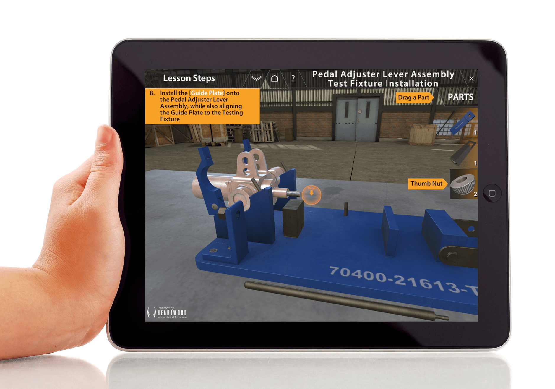
One of the training-related proposals our team was responding to had the following requirement: “The interactive training application should be easy to run and need not more than 2 (two) days to train the operator how to use it.”
Two days?! That should have read two minutes. Stop the madness.
While the ubiquitous coup of software is inevitable, given the countless advantages of digitizing processes, there has to be a better way. And there IS a better way. If you’ve ever paid a vendor with the SQUARE mobile card reader, you know what I am talking about. Beautiful. Easy. Fast.
One of the challenges we face at Heartwood is deciding which features to take out, rather than add in.
Our end-users are technicians and maintenance personnel who want the right information at the right time so they can get on with their day. Creating multiple drop-down menus on the top header with several more options in each does little beyond creating ‘tech intimidation.’ It is not conducive to learning, and it’s certainly not a good use of anyone’s time. Our challenge is to design training ‘for those who don’t like training’.
Less is truly more, and we couldn’t be more vocal about this in the office. It’s a mindset our customers definitely appreciate. But this philosophy is not new; long before Apple there was Dieter Ram, who laid down the ‘Ten Commandments‘ for good design.
If this resonates with you, you’ll like: The Zero Overhead Principle by DJ Patil –
“A universal lesson that I keep sharing with all entrepreneurs building for the enterprise is the Zero Overhead Principle: no feature may add training costs to the user.”
And you’ll love: Dog Ears….and the ‘ABSENCE-OF-ABRUPTNESS’
It’s time to say goodbye to needlessly complex technology. Don’t you agree? Contact us to talk with one of our 3D Interactive Training experts about how to make simplicity YOUR competitive advantage.